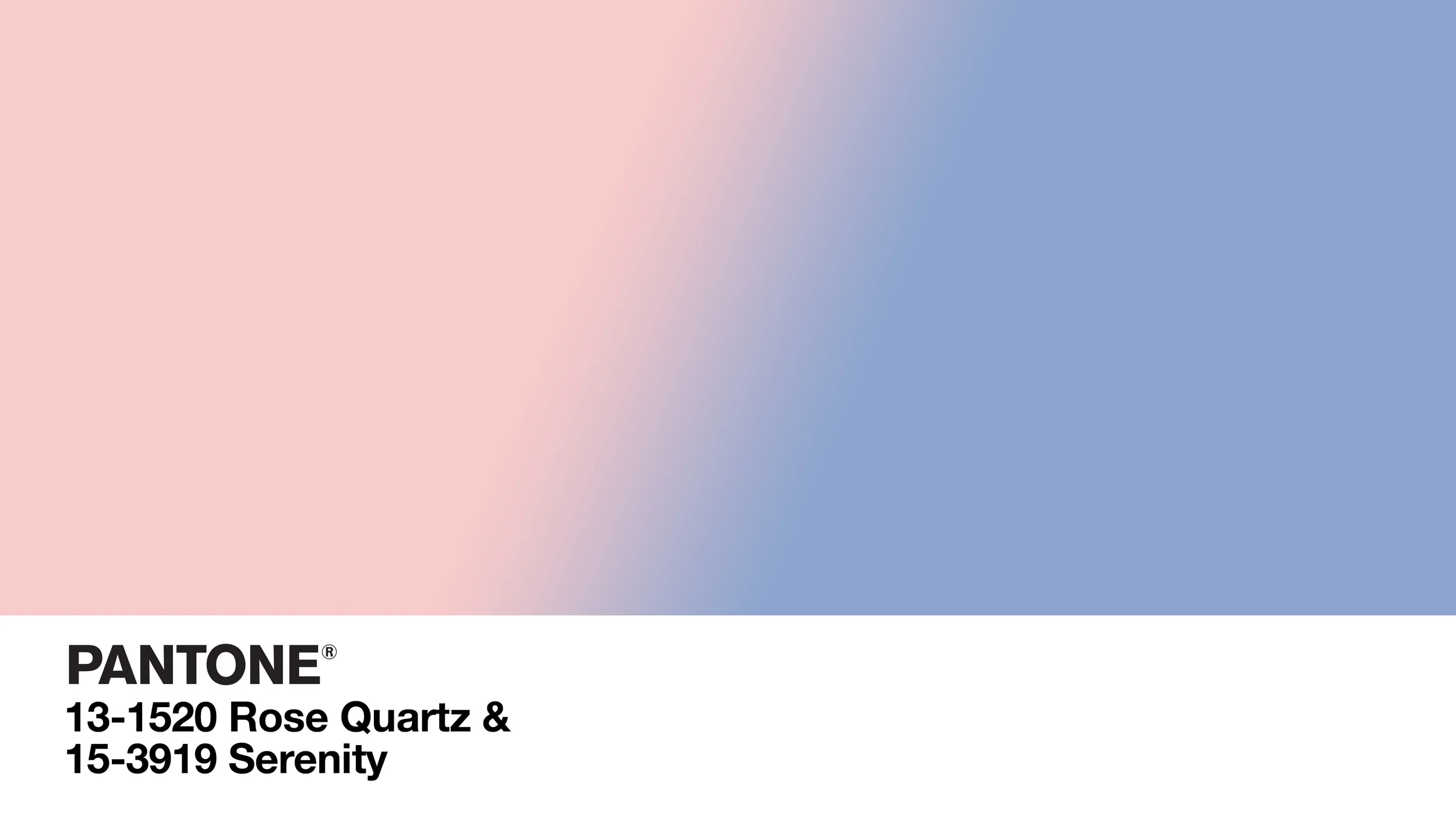
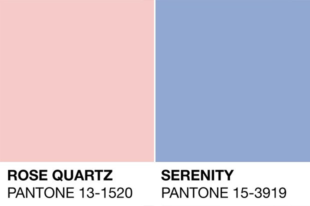
The Pantone Color Institute has announced its“ Pantone Color of the Year” for 2016. For the first time, two colors, Rose Quartz & Serenity, were chosen as the colors for 2016. Think a blush pink and a soothing, cool blue.
Both colors are equally worthy and stand strongly on their own and while also complementing each other beautifully.
“Joined together Rose Quartz and Serenity demonstrate an inherent balance between a warmer embracing rose tone and the cooler tranquil blue, reflecting connection and wellness as was a soothing sense of order and peace,” according to Leatrice Eiseman Executive Director, Pantone Color Institute.
In addition to wellness, the colors challenge the traditional perceptions of colors association. In fashion and interiors, there is a strong gender blurbreaking down the long held perception that “pink” is for girls and “blue” is for boys. In the US, unlike many countries, this is also a cultural shift.
I like the shift to two colors – when do we ever experience color alone? It is more realistic to consider color in relation to each other, or consider their “color interaction” which is a big component of color theory. Also, it is a welcome departure from the saturated jewel tones that have dominated Pantone’s choice for the last several years.
Since the announcement, I have been noticing these colors in use in fashion and interiors, and in nature! Take notice of the view outside NewStudio’ s office of a recent sunrise over the lake: Rose Quartz & Serenity are the stars of the show!
